

The power of CSS
CSS, like any language, has several peculiarities that make it unique and as amazing as it is today, and sometimes, there are moments when it's perfect but is not used for some random reason.
Today I'm going to show you how a nuisance of using too much Angular ended up leading to a series of refactorings in such a way that the final code uses only CSS and HTML and nothing from Angular.
Objective
To begin with, I will show what went before and what was asked. The context is as follows:
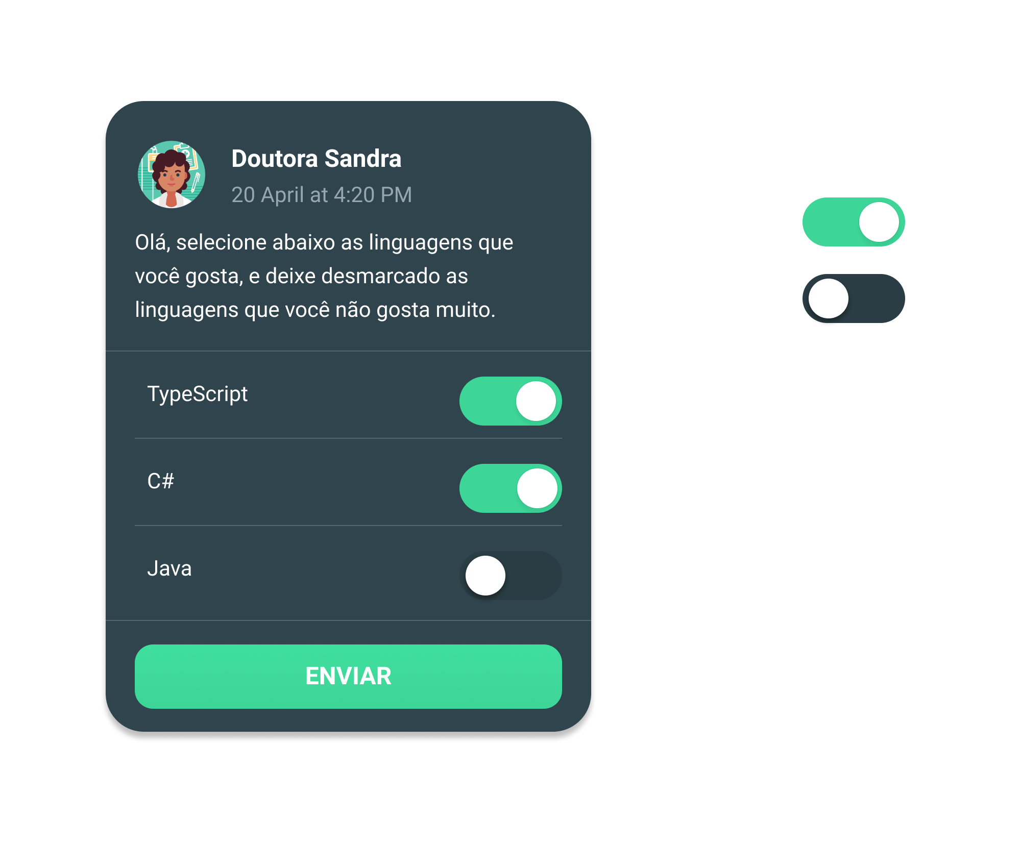
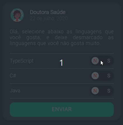
We have a Toggle that is used to mark the person's answer to a question of "Yes" and "No" to various options.
This Toggle is used in the Card above, and what was asked was that the Toggle needed to be clearer
with its purpose, in other words, it needed to indicate when it said "Yes" and when it said "No."
At first, it seemed like a strange request because it was clear to me that the "On" state, in green, indicated "Yes", and the state of "Off", turned off, indicated no.
However, the counterpoint was that a large part of the users were people who were not used to using apps. Thus, although intuitive for me as a developer, it could be confusing for people who are not used to use apps frequently.
Thus, the Layout of this Toggle, with the beautiful suggestion and implementation of a friend named Henrique Rodrigues, was changed to the following form:

Cute huh? I thought it was too much and manages to show, in a very clear way, the states of "Yes" and "No".
Well, with the Layout in hand, let's go to the first implementation.
The first implementation
Para facilitar o Toggle, usamos o Ion Toggle do Ionic, um componente pronto e fácil de customizar , a implementação fica assim:
<div class="app--toggle"><p>TypeScript</p><ion-toggle mode="md" [(ngModel)]="isSelected"></ion-toggle><span class="app--toggle--yes" [ngClass]="{'app--toggle--disabled': !isSelected}">S</span><span class="app--toggle--no" [ngClass]="{'app--toggle--disabled': isSelected}">N</span></div>
On .ts file:
...public isSelected: boolean;...
And on .scss file:
.app--toggle {display: flex;color: white;align-items: center;&--yes {position: absolute;right: 3rem;z-index: 100;color: #3DD598;font-weight: bolder;&--detail {right: 1rem;}}&--no {position: absolute;right: 6.7rem;z-index: 100;color: #FF464F;font-weight: bolder;&--detail {right: 4.7rem;}}&--disabled {color: white;}p {text-align: justify;font-size: 1.4rem;max-width: calc(100% - 6.5rem);}ion-toggle {margin-left: auto;--handle-background-checked: white;--background-checked: #3DD598;--handle-spacing: 0.4rem;--handle-width: 2rem;width: 6.5rem;min-width: 6.5rem;height: 2.8rem;padding-right: 0;padding-left: 0.5rem;}}
This is one of the possible implementations, and it solves the problem of having to put the "S" and the "N" next to Toggle.
What it actually does is, when Angular sees the following syntax [ngClass]="{'app--toggle--disabled': !isSelected}", it interprets it as follows:
- First, it receives the object passed to it.
- Secondly, it takes all the properties of the object and puts them in a list, that is, it takes the object and transforms it into
['app--toggle--disabled']. - Third, filter all properties with the following: only properties whose values are true should remain.
- Third, add the property name to the class list of the element in question, in this case, the
div.
That way, if isSelected is true, it will apply the app--toggle--disabled class to the element, which will make the text
change the color to white.
However, what bothered me is that I had to do this at least 15x during the project, and there were times when
the variable that keeps the information if it is selected or not was something like formGroup.controls.someVariableWithBigName.value.
So this code would start to get sooo long winded in the HTML, and that's something I didn't want.
But couldn't you create a component for that since you're using Angular?
The simple answer is yes, however implement the [(NgModel)] in the component, given past experience,
It's a pain and a bit buggy, and it takes a lot of time just to get it set up properly.
And I need the [(NgModel)], if not, to get the new value when he clicks the Toggle it turns one more
gambiarra than an implementation.
If you're not familiar with Angular, the
[(NgModel)]is basically the combination of thesetValueandvalueof theuseStatein React.
So I started creating a second implementation.
The second implementation
For this implementation, what I focused on reducing the verbosity of the HTML, and the result ended up being this:
<div class="app--toggle"><p>TypeScript</p><ion-toggle mode="md" [(ngModel)]="isSelected"></ion-toggle>- <span class="app--toggle--yes" [ngClass]="{'app--toggle--disabled': !isSelected}">S</span>- <span class="app--toggle--no" [ngClass]="{'app--toggle--disabled': isSelected}">N</span>+ <span class="app--toggle--yes">S</span>+ <span class="app--toggle--no">N</span></div>
On .scss file:
.app--toggle {...+ ion-toggle[aria-checked='false'] ~ span.app--toggle--yes,+ ion-toggle[aria-checked='true'] ~ span.app--toggle--no {+ color: white;+ }- &--disabled {- color: white;- }...}
The explanation of this implementation is as follows:
First I only look for the ion-toggle elements that have an aria-checked attribute of true.
This aria-checked is the attribute that basically indicates whether ion-toggle is enabled or disabled.
Once found, it uses the ~ selector, which basically looks for elements under the same parent that match some criteria, and applies the CSS to that element.
This is a good way to, from the conditions of an HTML element, apply CSS to elements that are not children but "siblings".
This is a fantastic trick that I saw in in this CodePen, which is used to check if the
checkboxis active, and if it is, activates the hairdryer animation.
And finally, it checks if there is any span with an app--toggle--yes class for when aria-checked is false,
and some span with the class app--toggle--no when aria-checked is false.
So, I have the same effect as before, only with a lot less HTML code.
But man, I still wasn't happy, I really didn't want to put any extra HTML in there, and even though I reduced it quite a bit, they were still
two lines of code per ion-toggle. And with that feeling of discontent, I moved on to the third and final implementation.
The third implementation
In this implementation, the code was beautiful, here is the complete code:
<div class="app--toggle"><p>TypeScript</p><ion-toggle mode="md" [(ngModel)]="isSelected"></ion-toggle>- <span class="app--toggle--yes">S</span>- <span class="app--toggle--no">N</span></div>
On .scss file:
.app--toggle {display: flex;color: white;align-items: center;- &--yes {- position: absolute;- right: 3rem;- z-index: 100;- color: #3DD598;- font-weight: bolder;- &--detail {- right: 1rem;- }- }- &--no {- position: absolute;- right: 6.7rem;- z-index: 100;- color: #FF464F;- font-weight: bolder;- &--detail {- right: 4.7rem;- }- }- ion-toggle[aria-checked='false'] ~ span.app--toggle--yes,- ion-toggle[aria-checked='true'] ~ span.app--toggle--no {- color: white;- }p {text-align: justify;font-size: 1.4rem;max-width: calc(100% - 6.5rem);}ion-toggle {margin-left: auto;--handle-background-checked: white;--background-checked: #3DD598;--handle-spacing: 0.4rem;--handle-width: 2rem;width: 6.5rem;min-width: 6.5rem;height: 2.8rem;padding-right: 0;padding-left: 0.5rem;+ position: relative;+ &:before, &:after {+ font-size: 1.3rem;+ position: absolute;+ color: white;+ top: 0.7rem;+ font-weight: bold;+ z-index: 10;+ }+ &:after {+ left: 1.4rem;+ content: "N";+ }+ &:before {+ right: 1rem;+ content: "S";+ }+ &[aria-checked='true']:before {+ color: #3DD598;+ }+ &[aria-checked='false']:after {+ color: #FF464F;+ }}}
Finally, the final solution was just in the CSS, it's beautiful to see that bunch of HTML and complex conditions turn into this small amount of CSS code.
For this solution, I totally relied on Pseudo Elements,
more specifically of :before and :after. By randomness, I chose the :after to put the N and the :before to put the S, and I put them
with position: absolute to get them in the correct position.
To place the texts, I used the content attribute, it is always mandatory, but normally empty quotes are used.
In this case, we gave it a new use by placing the text we wanted to position.
And after placing the content, it was enough to check if the aria-checked was true or false, and apply the correct color for each case, and the result was
this way:
Conclusion
One of the things I love most about being a programmer is that we have the ability to build and destroy things instantly. In other professions, like a Civil Engineer, if you get a few calculations wrong, you can't just go and tear down the bridge and build it again. And with programming, if I don't like it, I can go there and erase everything and redo it from scratch, just like we did today.
So the most important thing I take away every day is this: I always try to do my best with the amount of time given to me, and when time permitting, I'll take it easy and rewrite a few times to get the best result.
So whenever you have some free time and remember a code of yours that made you a little uncomfortable, go there and look for a way to optimize it. Particularly, I love these moments, it is almost certain that I will discover a new way to solve the same problem, and with that, acquire wisdom to solve the new problems in the best way.
Acknowledgments
To Wilson, my boss, for his request to carry out this visual improvement. And to Henrique, for suggesting that brilliant idea of putting the "S" and "N" on each end of the ion-toggle.